Unit Rate Heat Map: See Market Rates at a Glance
The unit-rate heat map colors a trade area by what facilities charge for standard unit types, so the high and low-priced pockets stand out immediately. This is a quick guide to how it works and how to use it in your market research.
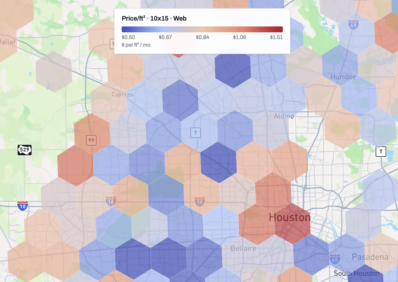
The unit-rate heat map colors a market by what facilities actually charge per square foot, one hexagon at a time. Pick a unit size, and the expensive and underpriced pockets of a metro show up.
You could pull the same numbers from the unit tab, where every rate we track in a market is listed. The heat map is for speed: it paints those advertised rates onto the map, so you get a quick understanding of what the market calls for and can see where pricing runs high or low without reading it out of a table.
What the heat map actually shows
Hexagons cover the map across the US, each one takes its color from the facilities inside it. The advertised rates for the unit size you've picked are turned into a price per square foot per month, and that number sets the color on a blue-to-red scale: blue means low rates, red means high rates.
See the average of all units, or pick a unit size: 5x5, 10x10, 10x15, 10x20, and the rest of the standard lineup. The rates shown are web rates, the prices facilities advertise online. Switch the unit type and the map redraws, since a market with expensive small units is not always expensive on large ones.
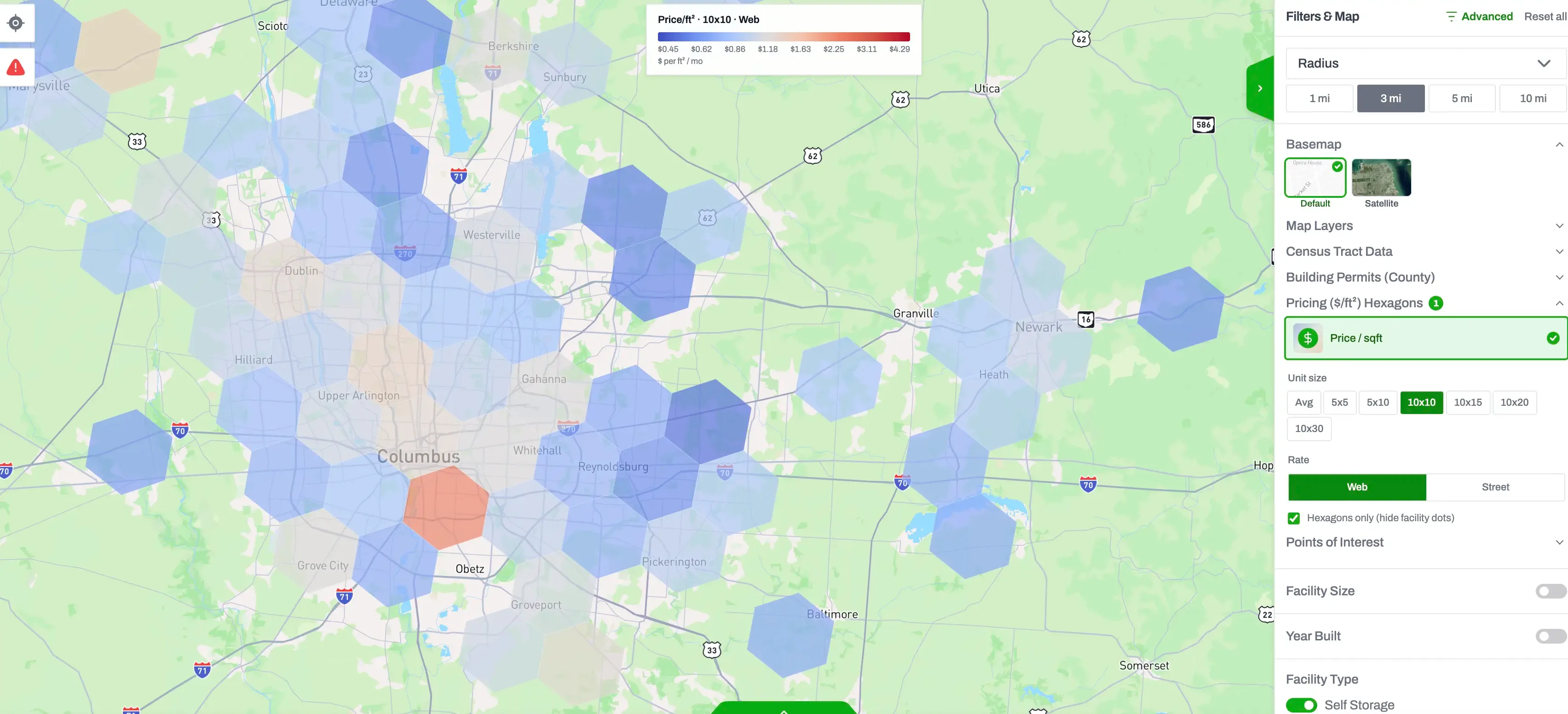
The heatmap layer lives in the Filters & Map side panel: select Price/sqft under Pricing Heatmap ($/ft²) & the layer overlays on top of the map. To get a clearer view, you can select the hexagons-only checkbox to clear all the facility dots off the map when you just want the pricing picture.
Why price per square foot instead of unit price
A $120 unit tells you very little on its own, because you don't know if it's a generous 10x15 or a tight 10x10 rounded up. Dividing by square footage puts every facility on the same axis, so a hexagon full of small-unit specialists and a hexagon full of drive-up 10x20s can be compared honestly. It's the same reason underwriters quote storage revenue per square foot rather than per unit.
What it's useful for
If you're screening markets to buy in, the blue pockets next to red ones are where to look first. Underpriced markets beside expensive ones can indicate owners haven't moved rates in years, and that gap is the value-add thesis in one picture. If you already operate a facility, find your hexagon and see which side of the local range you're on; being deep blue in a red neighborhood signifies potential for value add and ECRI (existing customer rent increase) waiting to happen. And if you're underwriting a specific deal, the map tells you quickly whether the seller's rates are the market or an outlier, before you anchor your model to them.
The color scale doesn't care what the owner thinks the market rate is. It shows what everyone around them is actually advertising.
Where the numbers come from
The heat map draws on the same rate dataset as the rest of the platform: 600,000+ individual unit rent rates collected from facility websites nationwide, updated daily. So when a hexagon reads $0.84, that's current advertised pricing per square foot, not a stale average from last quarter. If you want the detail underneath a hexagon, the same data is broken out per facility and per unit type; the rent-rate tracking page covers those views, including minimum and maximum prices for any unit in a market and how long since each rate changed.
The heat map is part of the standard platform, not an add-on. Unlimited access is $249.99 a month, or $199.99 a month billed annually; the pricing page has the full breakdown. Open a market you know well, flip through a few unit sizes, and check whether the colors match your instincts. Where they don't is usually where it gets interesting.
Get nationwide self-storage data
Try Storage Stats free, no credit card required. Rent rates, supply, demographics, ownership, and more, all in one platform.
Market data by city: Dallas–Fort Worth · Houston · New York · Atlanta · Chicago · Los Angeles · Phoenix · Miami · all 50 markets
More from the blog
RK Kliebenstein Joins Storage Stats as Brand Ambassador
Self-storage industry veteran RK Kliebenstein joins Storage Stats as Brand Ambassador, representing the company at industry events and supporting product development.
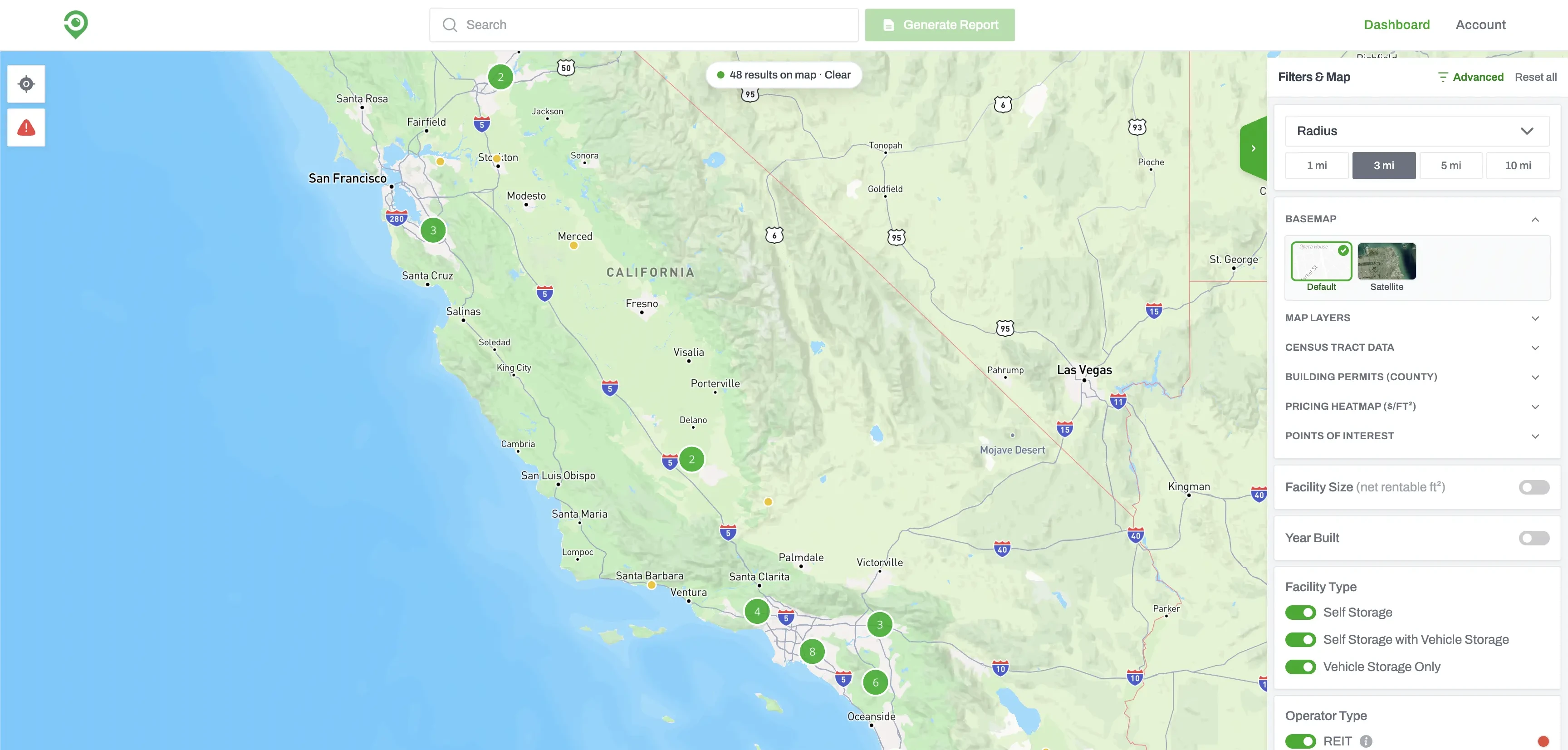
Build a Self-Storage Prospecting List with Advanced Filters
Advanced Filters lets you screen every self-storage facility in the country. Set your conditions, run the search, and you get back the facilities that match, ready to sort, map, or work through one at a time.
How Our PDF and Excel Exports Power Owner Outreach
Storage Stats exports two reports for every market, a Market Report and a Facility & Owner List, each as a PDF and an Excel. A rundown of what's in the four files and how they carry you from market research to owner calls.